Here’s the 2nd instalment of sharing my experience with engaging Nippon Paint Professional Paint Service to give my walls a little sprucing up.
So I covered my Living and Dining room in Part 1, now let’s move on to other exciting parts of the house like my master bedroom, guest room and of course, the nursery room! :)
MASTER BEDROOM
We used Nippon Momento™ Special Effects Paint for the Dining Room area and I was excited to see where else can I inject more of these very attractive, wallpaper-like textured walls. The master bedroom, which is also my bedroom, has uneven walls because when I renovated the house, I wasn’t big on spending on smoothening the walls.
When Joanne, my Nippon Paint project manager saw the uneven walls, she agreed that using Nippon Momento™ Special Effects Paint would be excellent on this wall because it will hide all it’s flaws.
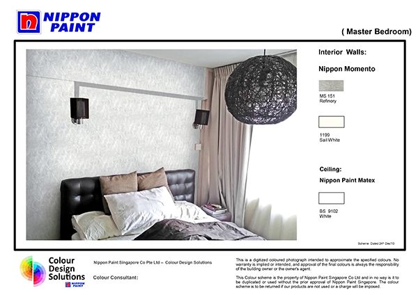
I chose a very shimmery colour for the feature wall – MS 151 Refinery. :) It matches the greyish tone I have on my inbuilt wardrobes. I think this will turn out super nice.
GUEST ROOM
This is the guest room. The current colour is brownish to match the brown furnishings. Actually this is the wall colour I liked the most our of the whole house but a new uplifting colour is needed. I shared with Joanne on how we wanted something soothing and welcoming – it is a room for guests after all.
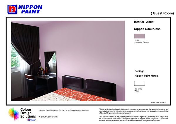
Joanne suggested Colour Code 15111 (Lavender) for us. It’s a soothing purplish colour that’s not overpowering. <3 Just wanted to say that Joanne was super patient with us. We really couldn’t decide what colour we wanted :) There were so many choices! :)
NURSERY
And of course, how could we forget, the nursery. This is what sparked the whole repaint of the house. We wanted to welcome our little sweetheart with a nice room of his own, and that started #projectnursery.


We wanted a soothing blue and a colour that matches these safari decals that we fell in love with.
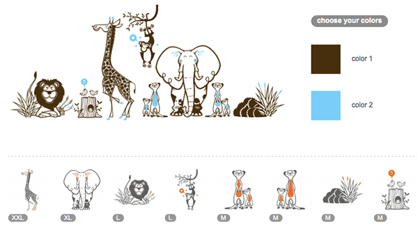
We weren’t sure whether to have a feature wall or just paint all 4 walls the same colour. Joanne was super helpful in her suggestions. She saw the decals and immediately recommended for us to go with Colour Code 8109 (Peace) for the whole 4 walls.
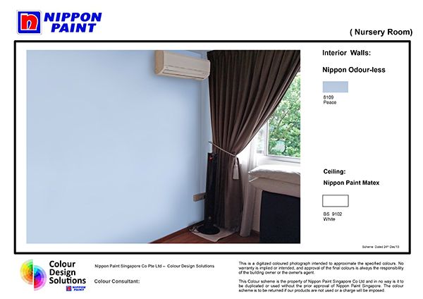
We were also going to put up some small paintings as well, so it all had to be well-matched. I really the peaceful blue that we decided on. Can’t wait to see how everything goes together! :)
Check out how the painting in progress went!
Stay tuned for pictures to see how it looks like after! :)
**
If you’re interested, do call Nippon Paint Professional Painting Services at 6319 7222 for a quote! More information here.
Nippon Paint
Website | Facebook | Promotions
Read all my Nippon Paint-related posts here!